
AI replaces tasks, not thinking
At first glance, everything feels replaceable.
UI, copy, flows — AI can generate all of it. Fast. Faster than any designer could.
But when you actually use it in real work, something becomes obvious.
It produces. But it doesn’t decide.
It doesn’t know what matters.
It doesn’t understand trade-offs.
It doesn’t feel the consequence of being wrong.
I came across a Reddit thread that described this feeling almost perfectly:
AI can generate UI instantly - but why does it still feel ‘off’? ↗
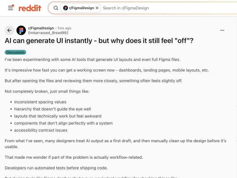
“something often feels slightly off”
“layouts that technically work but feel awkward”
“hierarchy that doesn't guide the eye well”
That’s exactly it.
The output works.
But it doesn’t hold together.
That’s the gap:
AI is automating execution, not thinking. The work isn’t disappearing — it’s being stripped down to judgment, direction, and decision-making.
→ Your value shifts from doing the work to defining what good work is.
Once you see that, the fear changes.
Because if execution is no longer the edge… something else has to be.
Execution is baseline now
That “something else” shows up quickly.
Execution used to be the craft.
Clean UI, structured layouts, polished screens.
Now AI can generate that in seconds.
So the problem isn’t “can we make something?” anymore. It’s “which one should we choose?”
This thread captured that shift clearly:
What am I missing about UI + AI? ↗
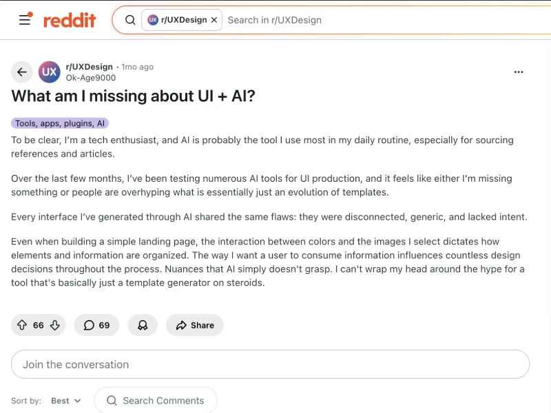
“they were disconnected, generic, and lacked intent.”
“a tool that's basically just a template generator on steroids.”
People aren’t blocked by creation anymore.
They’re blocked by decision.
If you follow that behavior, it usually plays out like this:
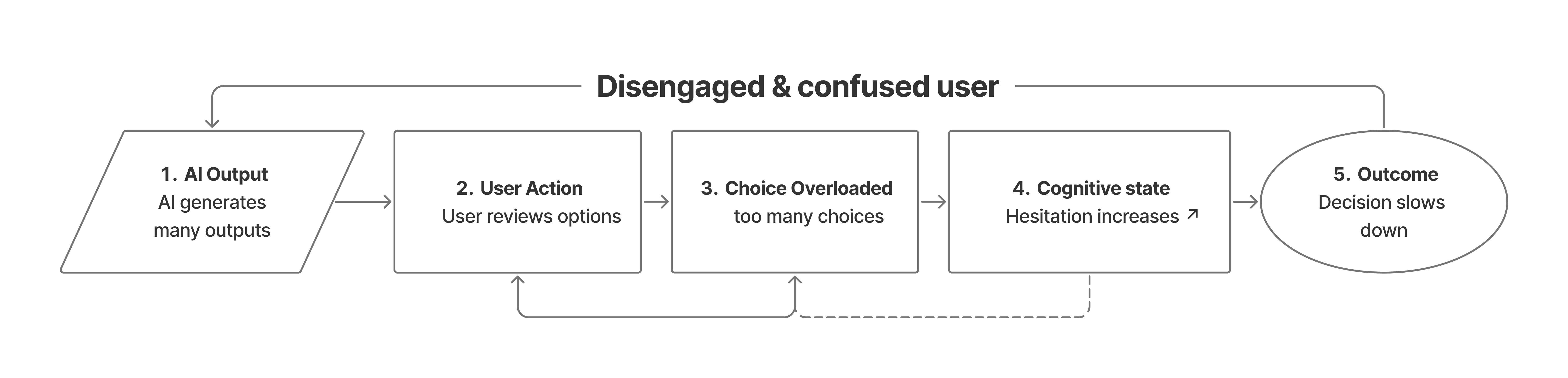
And this is where it starts to break:
Execution is no longer the differentiator. When everyone can produce good-enough outputs, value shifts to judgment — defining quality, making trade-offs, and choosing what actually works.
→ Your edge is no longer making things, but deciding what should exist.
Because when everything looks fine… nothing stands out.
And when nothing stands out… users hesitate.
Good AI removes choices
At first, more AI feels like more power.
More outputs.
More variations.
More possibilities.
But in reality, it creates more decisions. And more decisions usually mean more friction.
You can see it in how people react to AI-generated design:
Isn’t it weird UX that many AI tools make users pick models? ↗
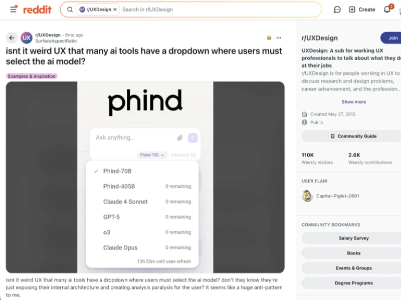
“they rarely understand why those layouts work.”
“it doesn’t grasp hierarchy, intent, or flow.”
That’s the real issue. Not capability. Clarity.
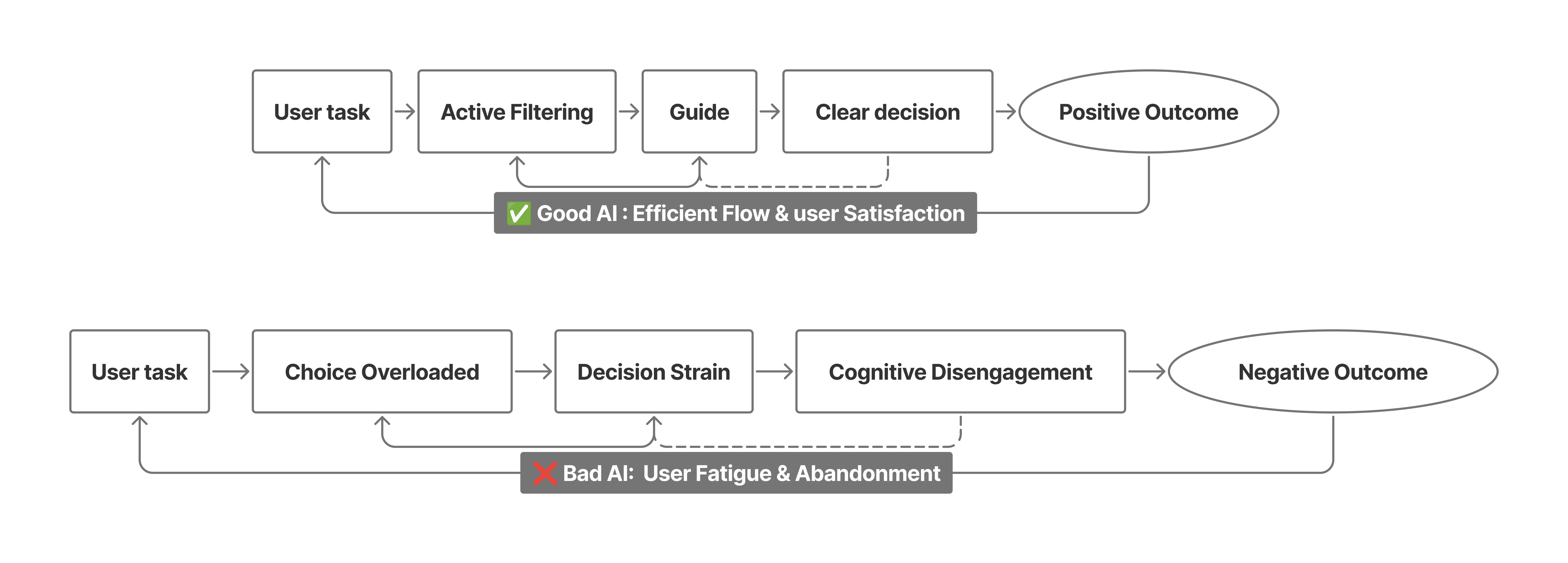
Bad AI takes one task… and turns it into five decisions.
If you break that down, the pattern becomes obvious:
And this is the real shift:
AI doesn’t reduce work if it multiplies decisions. More outputs create more cognitive load, not less.
→ Great AI removes unnecessary choices and guides users toward clear decisions.
That’s when your mindset changes.
You stop asking “what can we add?”
And start asking “what can we remove?”
But even if you remove enough… something still breaks.
Timing beats more features
This one took me longer to understand.
Because at first, it doesn’t look like a problem.
AI feels helpful. It suggests things. It generates ideas. It tries to assist.
But after using it for a while, something starts to feel… off again.
Not because it’s wrong.
Because it shows up at the wrong moment.
I noticed this when working with tools that constantly suggest things while I’m in the middle of a task.
You’re thinking. You’re focused. You’re building momentum.
And then suddenly:
A suggestion appears.
A panel opens.
A new option shows up.
Nothing is technically broken. But your flow is.
This isn’t just an AI problem.
You can see the same frustration in how people talk about modern design tools:
Where do you think Product Design is going? ↗
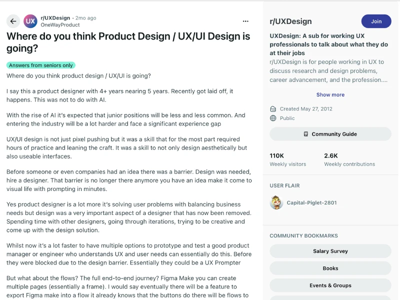
“there was a barrier… that barrier is no longer there anymore”
When everything becomes easier to generate…
everything also becomes easier to interrupt.
The problem isn’t that AI helps.
It’s that it helps at the wrong time.
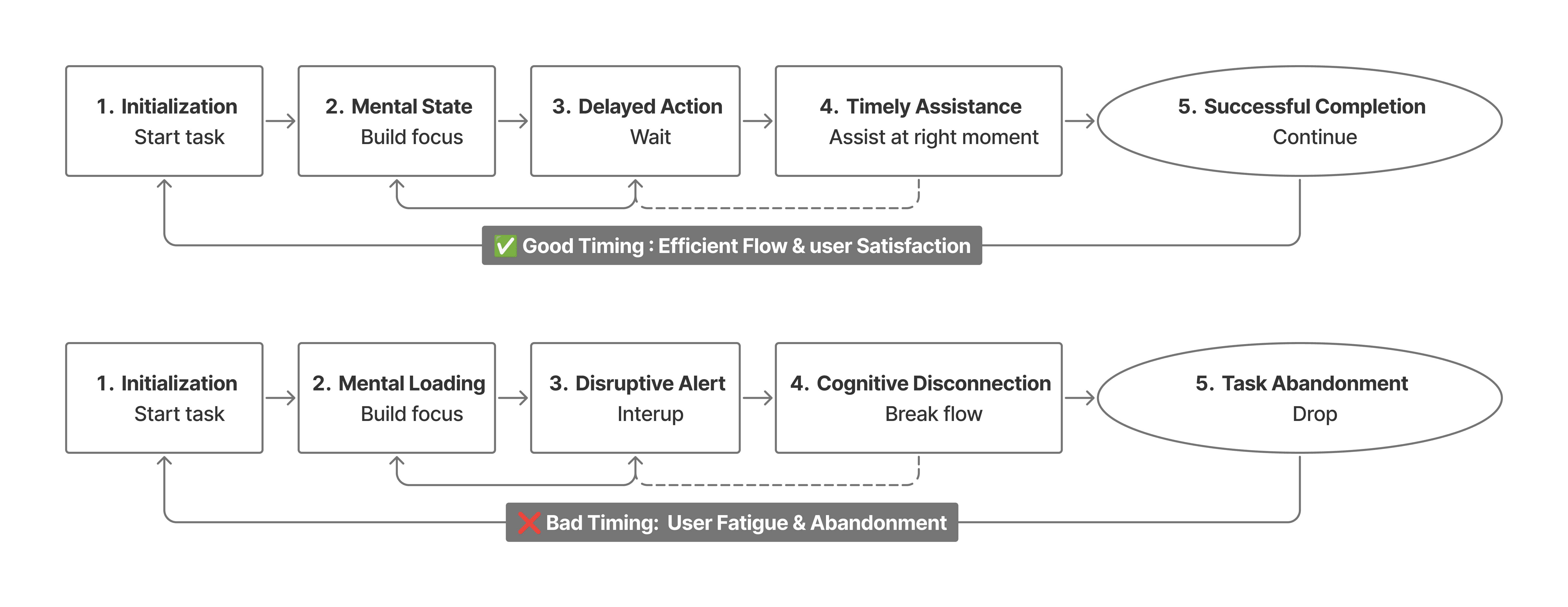
If you map that behavior, it looks like this:
And this is where it becomes clear:
AI can be powerful, but if it appears at the wrong moment, it creates friction instead of value.
Capability isn’t the problem.
Timing is.
That’s the shift most tools haven’t figured out yet.
They focus on what AI can do.
But users experience when it shows up.
So the real question becomes:
When should the system step in?
When should it stay out of the way?
When is help actually helpful?
And that’s the shift:
AI can be powerful, but if it appears at the wrong moment, it creates friction instead of value. Capability isn’t the problem — timing is.
→ The best AI systems know when to act, not just what to do.
Bad AI interrupts.
Good AI waits.
And the difference between those two is what defines the experience.
Design behavior, not screens
At this point, everything connects.
Execution is automated.
Choices are overwhelming.
Timing becomes critical.
So what’s left?
Behavior.
Not UI. Not screens. It's Behavior.
One comment summed it up bluntly:
“AI doesn't understand anything… It's the amalgamation of its data sets.”
Another way to put it:
“AI can make something look good. It can’t make it make sense.”
That difference is everything.
And this is the shift most people miss:
As execution becomes automated, the interface matters less than how the system behaves. The real design layer is logic, timing, and response.
→ Designers are no longer shaping screens — they’re shaping behavior.
We decide when the system should step in.
When it should stay silent.
How confident it should be.
How wrong is acceptable.
These aren’t UI decisions but behavior decisions.
AI didn’t take my seat.
It just made it impossible to ignore what my seat actually is.


