Important Emails Disappear in Team Inboxes
Conversations were visible. Their state was hidden.
Important conversations seemed to slip through the cracks.
A customer follow‑up would be missed.
A discussion would resurface unexpectedly.
Someone would ask whether a request had already been handled.
As inboxes became busier, people spent more time figuring out what deserved attention and less time acting on it.
Most teams described the problem the same way:
"Important emails keep getting buried."
At first, we believed they were right.
Product
Twake Mail
Company
Linagora
Timeline
6 weeks
Focus
Communication Awareness
Conversation State
Decision visibility
Methods
Shadowing
Observation
Workflow Mapping
Prototype Validation

UNDERSTAND THE BREAK
Signals from the field
The project began with a recurring concern raised by teams:
Important emails were getting buried.
Across interviews, observations, support discussions, and industry conversations, the same frustration appeared repeatedly.
At first glance, it seemed like a prioritization problem.
Important conversations appeared to disappear beneath the constant flow of new messages.
But the behaviors we observed suggested something different.
People could usually find the conversation.
What they struggled to understand was what was actually happening inside it.
Conversations that looked urgent had already been resolved.
Active discussions looked identical to routine updates.
Important context existed, but only after opening the thread.
As inbox volume increased, people spent more time investigating conversations before deciding what required attention.
Signals


Drag the top card to explore the artifacts behind this story.
What connected these signals
Although the wording varied, the behaviors were remarkably similar.
People compensated by:
Opening threads repeatedly
Reading recent replies before acting
Rechecking conversations for updates
Asking teammates for clarification
Using chat tools to verify context
Creating personal reminders to revisit discussions
People could see incoming conversations.
But they couldn't easily tell:
Whether a discussion was still active
Whether new information had changed the situation
Whether the issue had already been resolved
Whether attention was still required
As a result, teams spent time investigating before they could decide.
Synthesis Wall
Recurring patterns clustered into five themes:
Hidden Conversation State
Context Buried in Threads
Repeated Checking
Decision Uncertainty
Communication Happens Elsewhere
These themes appeared consistently across interviews, observations, and industry research.

Research synthesis wall illustrating how interviews, observations, and industry signals converged into a single insight: teams could see conversations, but struggled to understand conversation state.
From patterns to people
The themes weren't isolated to a single role, team, or workflow.
The same challenges appeared across customer support, project management, operations, product, and research teams.
Rather than segmenting participants by job title, I looked at how people behaved when navigating ongoing conversations. Several recurring patterns emerged:
Some actively monitored inbox activity
Some gathered context before responding
Some waited for stronger signals before engaging
Others relied on external tools to understand what was happening
Despite their differences, they were all trying to answer the same question:
"What is happening inside this conversation — and do I need to be part of it?"
That observation became the foundation for the behavioral archetypes below.
Behavioral Archetypes
Understanding recurring inbox behaviors
The same uncertainty surfaced across different roles, teams, and workflows — regardless of the interview or shadowing session.
The challenge wasn't limited to support teams, project managers, researchers, or specialists.
People approached conversations differently,
but they often stopped at the same questions before taking action.
What is happening here?
Is this conversation still active?
Has somebody already responded?
Do I need to pay attention to this?
Rather than grouping participants by job title, I synthesized them into seven recurring behavioral patterns — based on how they interpreted conversation activity and decided whether attention was required.

Seven behavioral archetypes emerged from a shared uncertainty: understanding conversation state before taking action.
What Connected These Archetypes
Although each archetype approached conversations differently,
they all depended on understanding conversation state before taking action.
Despite their differences, they often relied on the same workarounds:
Opening threads repeatedly
Searching for recent updates
Re‑reading previous replies
Asking teammates for clarification
Creating personal reminders
Different behaviors. The same uncertainty.
People repeatedly investigated conversations before deciding whether attention was needed.
The inbox provided access to conversations, but it did not provide enough visibility into what was happening inside them.
As a result, people spent time investigating before they could decide.
That recurring pattern became the focus of the next stage of analysis.
Where it breaks
The breakdown happened surprisingly early.
Not while replying.
Not while coordinating.
While scanning.
Before taking action, people first tried to understand what was happening around a conversation.
Was it still active?
Had someone already responded?
Did it still require attention?
The inbox provided access to conversations, but very little visibility into their current state.
As a result, people compensated by:
Reopening conversations
Checking recent replies
Searching for updates
Marking emails unread
Relying on memory
As inbox volume increased, these workarounds became increasingly fragile.
Different people followed different workflows, but they often encountered the same hesitation:
"I can see the conversation. I can't tell what's happening inside it."
Inbox Scanning Journey
What the workflow revealed
Repeated thread openings were rarely attempts to understand the message itself.
They were attempts to understand the state of the conversation.
People searched for information that technically existed, but only became visible after opening the thread:
Whether the issue was already resolved
Whether discussion was still ongoing
Whether important updates had been added
Whether attention was still required
As a result, people spent time reconstructing context before making decisions.
That distinction became important.
The challenge wasn't helping people find conversations.
It was helping them understand what was happening around those conversations.
The inbox supported communication.
It provided very little visibility into conversation state.
What's actually wrong
The evidence from interviews, workflow mapping, and validation sessions all pointed to the same disconnect.
People could usually see the conversation.
What they couldn't easily see was its state.
Questions that seemed simple often required opening the thread:
Is this discussion still active?
Has someone already responded?
Did new information change the situation?
Does this still require attention?
The information existed.
It was simply buried inside the conversation itself.
As a result, people spent time reconstructing context before making decisions.
Expectation vs Reality
User Expectation | System Reality |
|---|---|
I can tell what is happening. | I can only see that a conversation exists. |
I know whether discussion is ongoing. | Activity is hidden inside the thread. |
I know whether attention is still needed. | Status must be inferred manually. |
I understand who is involved. | Participation becomes visible only after opening the conversation. |
The Real Problem
The challenge wasn't helping people find conversations.
It was helping them understand what was happening around those conversations.
The inbox supported communication. Messages arrived. People read them. Information was exchanged.
But the interface communicated very little about the state of those conversations.
As a result, people compensated:
Reopening threads
Searching for updates
Relying on memory
Asking teammates for clarification
Creating their own awareness systems outside the product
When people repeatedly create workarounds for the same uncertainty, the problem is rarely their behavior.
It's usually a signal that the product isn't communicating something important.
Reframed Problem
The issue wasn't visibility.
The issue was awareness.
Instead of asking:
"How do we make important emails more visible?"
We began asking:
"How do we make conversation state visible before people open the thread?"
That shift fundamentally changed the direction of the project.
Rather than designing a better way to separate important conversations,
we began exploring ways to make conversation state visible directly within the inbox itself.
That question became the foundation for the concepts explored next.
EXPLORE THE DECISION
Two ways to solve it
Once the research made the root problem clear, the conversation shifted.
The challenge was no longer helping users find important emails.
It was helping people understand the state of a conversation while scanning the inbox.
That led to two competing directions.
Both appeared capable of improving awareness.
Both had strong arguments behind them.
The question was which approach would support real inbox behavior more effectively.
Option A — Separate Important Conversations Into Their Own Workspace
The first direction focused on separation.
Important conversations would be collected into a dedicated Important view, allowing people to review high‑priority discussions independently from the rest of the inbox.
What it offered
Cleaner prioritization
Stronger categorization
Reduced visual clutter
Dedicated space for reviewing important conversations
What concerned us
Additional navigation step
Fragmented awareness
Context switching between views
Dependence on users remembering to check another place
This approach treated awareness as a destination.
Users would leave the inbox to understand what deserved attention.
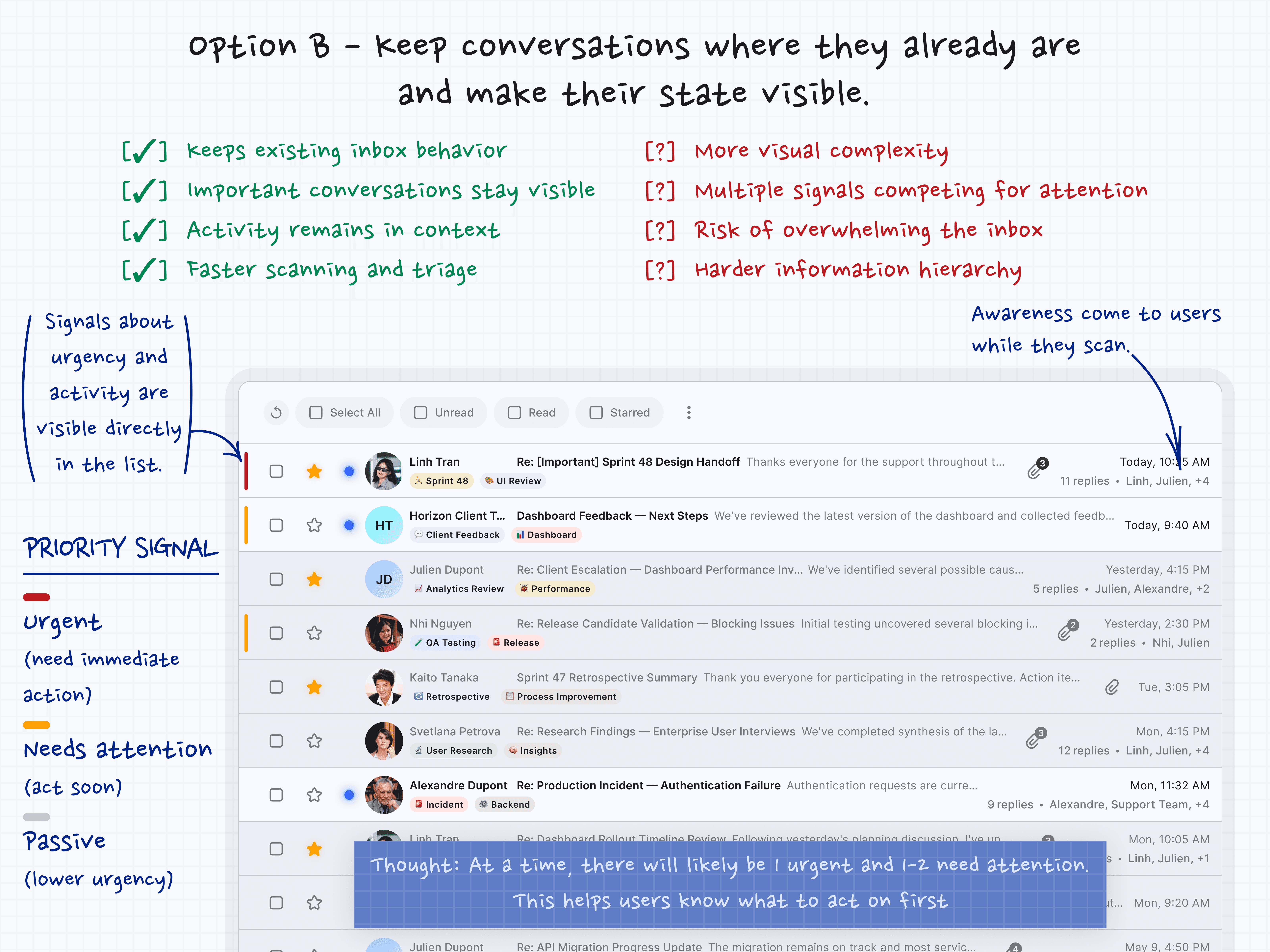
Option B — Surface Awareness Signals Directly Inside the Inbox
The second direction focused on visibility.
Instead of moving conversations elsewhere, important discussions would remain inside the inbox — while signals about urgency and activity became visible directly within the email list.
Early concepts explored
Priority Signals
Red → likely needs immediate attention
Yellow → likely needs attention soon
None → lower urgencyConversation Context Signals
Reply count, participant count, visible discussion activity —
context available without opening the threadThe goal was to make conversation state visible without requiring users to leave the inbox.
The goal was to make conversation state visible without requiring users to leave the inbox.
What it offered
Preserved existing scanning behavior
Continuous visibility of important conversations
Better communication awareness during triage
Fewer navigation costs
What concerned us
Greater visual complexity
Multiple signals competing for attention
Increased hierarchy challenges
Risk of overwhelming the inbox
This approach treated awareness as part of the inbox itself.
The Real Trade-off
At first glance, the discussion appeared to be about prioritization.
In reality, it was a choice between two very different philosophies.
Both directions improved awareness.
The difference was where that awareness lived.
Option A separated important conversations into a dedicated destination.
Option B kept important conversations visible inside the existing workflow.
The question became:
Should users go somewhere else to understand what matters?
Or should that understanding happen directly inside the inbox?
At this stage, neither direction was clearly better.
Both solved part of the problem.
The next step was to evaluate them against the behaviors we observed in the field.

EXPLORE THE DECISION
Getting to alignment
The trade‑offs were clear.
But choosing a direction required more than comparing interfaces.
We returned to the evidence gathered throughout the project:
interview findings, shadowing observations, synthesis outputs, and workflow maps.
A consistent pattern resurfaced.
People rarely struggled to notice conversations.
What they struggled with was understanding what was happening around those conversations.
Was the discussion still active?
Had things changed?
Was attention still needed?
The problem wasn't visibility.
It was awareness.
The Turning Point
Early discussions focused on organization — which interface looked cleaner, which approach felt simpler.
Gradually, a different question emerged:
"How easily could people understand the state of a conversation while scanning the inbox?"
That shift moved the conversation away from personal preferences and toward observed behavior.
The question was no longer where important conversations should live.
It was where awareness should appear.
Alignment Outcome
The team aligned around a simple principle:
Awareness should remain attached to the workflow.
Rather than creating another destination for important conversations, the inbox itself would provide more context about what was happening around them.
Decision
The direction became explicit:
Make conversation state visible directly in the inbox.
This didn't eliminate organizational tools.
But it meant priority signals and conversation context would live inside the inbox,
reducing the need to open threads just to assess the situation.
The guiding principle that emerged:
Prioritize visibility over tidiness.
The product should help people understand what was happening while they scanned,
even if that meant a slightly richer interface.
That principle became the foundation for the system we introduced next.
BUILD THE FIX
The system we introduced
This wasn’t a new workflow.
It was a new layer of awareness applied to the existing workflow.
No new tabs.
No separate workspaces.
No additional navigation.
Instead of moving conversations somewhere else, the inbox itself became easier to understand.
The goal was simple: help people understand what was happening around a conversation before deciding what to do.
Two Layers of Awareness
The solution introduced two lightweight signals directly into the inbox:
Priority Signals
Conversation Context
Together, they helped reduce uncertainty during scanning while preserving the inbox experience people already knew.
Priority Signals
Priority provides an early signal about the likelihood that a conversation deserves attention.
A simple visual indicator appears on the left side of the email row:
Red → likely needs immediate attention
Yellow → likely needs attention soon
No indicator → lower urgency
The goal wasn’t to automate prioritization.
The goal was to help people identify conversations that may deserve a closer look — without requiring additional effort.
Priority becomes visible before a conversation is opened.
Conversation Context
Priority alone doesn’t explain what is happening around a conversation.
To provide additional awareness, the inbox surfaces lightweight conversation context directly within the email list.
Examples include reply count and visible participant activity.
A conversation might display:
12 replies • Linh, Julien, +3
These signals don’t explain the entire conversation.
They provide enough context to help people understand whether discussion already exists, who appears to be involved, how active the conversation is, and whether further investigation is likely necessary.
Instead of opening a thread just to determine whether activity exists, people can gather that information while scanning.
Why This Works
The system doesn’t ask people to learn a new workflow.
It supports the workflow they already have.
Priority answers: Should I look at this?
Conversation context answers: What appears to be happening around it?
Together, these signals help people make decisions with less context reconstruction and fewer unnecessary thread openings.
The inbox continues to function as an inbox.
It simply becomes easier to understand.
Priority signals are derived from visible conversation metadata, not opaque algorithms – so teams can trust what they see. The indicators rely on colour, icons, and labels together, ensuring they are perceivable by everyone.
Instead of creating another destination, the solution makes awareness visible where decisions already happen.
What changed in the interface


From reconstructing conversation state manually to understanding more while scanning. The inbox remains familiar, but awareness becomes visible before a conversation is opened.
The inbox didn't change its content.
The same conversations still existed.
The same senders.
The same subjects.
What changed was how much awareness became available during scanning.
Before: Understanding Required Investigation
The original inbox presented conversations as a flat list.
Messages appeared side by side with very little indication of what was happening around them.
Important discussions looked similar to routine updates.
Active conversations looked similar to inactive ones.
Understanding whether a conversation required attention often meant opening the thread, checking replies, and reconstructing context manually.
People could see conversations.
What they struggled to see was the state of those conversations.
Scanning frequently turned into investigation.
After: Awareness Appears Earlier
The redesigned inbox surfaces more awareness before the first click.
Instead of relying entirely on memory, recent activity, or thread exploration, people can understand more while scanning the inbox itself.
Conversations that may require attention become easier to identify.
Ongoing discussions become easier to recognize.
Activity that previously required investigation becomes visible earlier in the workflow.
Rather than opening conversations simply to understand what is happening, people can make better decisions about where to focus before entering a thread.
What This Means
The redesign doesn’t change how people work.
It changes how quickly they can understand what they are looking at.
Where the previous experience required users to gather context manually, the new experience provides more awareness upfront.
Instead of asking:
“What is happening in this conversation?”
People can begin asking:
“Does this deserve my attention?”
The inbox remains a communication tool.
It simply becomes easier to interpret.
What made this hard
Once the team aligned around keeping awareness inside the inbox, the solution appeared straightforward.
Surface conversation state.
Reduce uncertainty.
Help people understand more before opening a thread.
In practice, the difficult part was not adding information.
It was deciding how much information was enough.
When Everything Looks Important
Priority signals worked well when only a small number of conversations required attention.
But real inboxes rarely behave that way.
Some days contained multiple escalations, ongoing discussions, and unresolved decisions at the same time.
This exposed an important limitation:
Priority does not create order. It creates awareness.
A single urgent conversation is easy to understand.
Several urgent conversations create a different question:
Which one should I look at first?
The solution was not to keep adding more priority levels.
Instead, priority became a lightweight signal rather than a ranking system.
The goal was never perfect prioritization.
The goal was helping people notice conversations that may deserve attention.
Where Priority Comes From
Another challenge emerged around how priority should be assigned.
At first glance, automatically determining which conversations deserve attention appears straightforward.
In practice, enterprise email environments introduce a different requirement:
People need to trust the signal.
A priority indicator that feels unpredictable quickly loses credibility.
The solution was intentionally lightweight.
Rather than relying on opaque AI‑generated classifications,
priority signals were derived from existing conversation metadata and workflow rules already available within the product.
The goal was not to determine importance with certainty.
The goal was to surface conversations that may deserve closer review.
This approach helped preserve transparency while remaining compatible with the security, privacy, and compliance expectations common in enterprise communication environments.
Awareness Without Reordering
Another question emerged during design:
Should conversations with priority signals automatically move to the top of the inbox?
At first glance, the idea seemed reasonable.
If something is important, why not place it first?
But reordering conversations introduced a different problem.
The inbox no longer reflected the natural flow of communication.
Recent conversations could appear below older ones simply because they carried different priority levels.
The experience began to feel more like a task manager than an inbox.
Ultimately, conversations remained in chronological order.
Priority became visible without changing where conversations lived.
People gained awareness without losing the familiar structure of the inbox.
How Much Context Is Enough?
Once conversation context became part of the solution, another challenge appeared:
How much context should be visible during scanning?
Showing too little recreated the original problem.
Showing too much created a new one.
The inbox risked becoming a dashboard filled with statuses, ownership markers, and workflow mechanics.
The goal was never to expose the full state of a conversation.
It only needed to answer a simpler question:
Is there already activity around this discussion?
That led to a deliberately lightweight approach.
Reply activity and participant visibility provided enough context to support decision‑making without overwhelming the interface.
The inbox remained a communication tool rather than becoming a project management system.
What This Revealed
The hardest part of the project was not designing new signals.
It was deciding what not to show.
Every additional piece of information increased awareness.
It also increased complexity.
The final solution emerged by balancing those two forces.
Not maximum information.
Just enough information to help people understand what was happening before they opened a conversation.
IMPACT & THINKING
What changed in behavior
The most important change wasn’t in the interface.
It was in how people made decisions.
Before, participants spent a surprising amount of time reconstructing context.
They opened conversations to understand whether discussion already existed.
They checked replies to see how active a conversation was.
They relied on memory to remember which discussions still required attention.
The work itself wasn’t always difficult.
Understanding the state of the work was.
Before: Decisions Required Investigation
The original inbox made conversations visible.
But it provided very little awareness of the activity surrounding those conversations.
As a result, participants often paused before acting.
Not because they lacked information.
Because they lacked confidence.
Questions such as:
Is this discussion active?
Has anyone already responded?
Does this still require attention?
Should I look into this now?
often required opening the thread to answer.
Scanning frequently turned into investigation.
After: Awareness Arrives Earlier
Once conversation awareness became visible inside the inbox,
participants approached scanning differently.
They no longer needed to open every conversation simply to understand what was happening around it.
Instead, they could gather enough context during scanning to decide where their attention was most likely needed.
Several participants described feeling more confident while triaging incoming conversations.
Not because they had more information.
Because they had enough information earlier.
Awareness moved closer to the moment of decision.
What Users Said
"Now I know where to start."
— Support team member
Post-validation interview
Another participant described the change differently:
"I don't have to open everything anymore."
— Operations specialist
Post-validation interview
Neither comment focused on the interface itself.
Both focused on reduced uncertainty.
What Actually Changed
The inbox stopped functioning as a place that only displayed conversations.
It became a place that communicated something about those conversations before they were opened.
Participants still explored threads when they needed deeper context.
But they no longer needed to do so simply to understand whether activity already existed around a discussion.
The first decision became easier.
And because that decision happens hundreds of times throughout the day, the impact accumulated quickly.
Takeaway
People weren’t struggling to process information.
They were struggling to understand what was happening around that information.
The redesign didn’t remove work.
It removed uncertainty.
And that small shift changed how people approached the inbox every day.
What this problem revealed
At the beginning of the project, the problem appeared straightforward:
Important conversations were being missed.
The obvious response was to make those conversations more visible — through stronger indicators, a dedicated workspace, or improved prioritization.
But the research revealed something more interesting.
People usually noticed the conversations.
What they struggled to understand was what was happening around them.
Was the discussion still active?
Had someone already responded?
Did it still require attention?
Did they need to do something?
The challenge wasn’t visibility.
It was awareness.
That distinction changed how I thought about the problem.
The inbox wasn’t failing as a communication tool.
Messages arrived.
People read them.
Information was exchanged.
The failure happened in the space between seeing information and deciding what to do with it.
The interface communicated conversations. It communicated very little about the state of those conversations.
As a result, people compensated:
Opening threads
Checking replies
Relying on memory
Creating their own awareness systems outside the product
When people consistently create workarounds for the same uncertainty,
the problem is rarely their behavior.
It’s usually a signal that the product isn’t communicating something important.
A Broader Product Principle
The lesson extends beyond email.
Many products focus heavily on helping people complete actions.
Far fewer focus on helping people understand situations.
Yet understanding often comes first.
Before people can respond, prioritize, collaborate, or decide, they need awareness.
They need enough context to understand what is happening.
Without that awareness, every decision becomes slower, heavier, and more dependent on personal interpretation.
What this project ultimately taught me is that good product design isn’t only about making actions easier.
It’s about making decisions easier.
Sometimes the most valuable thing a product can do is reduce uncertainty —
before a user clicks anything at all.
Not by showing everything.
Not by creating more workflows.
But by surfacing the right signals at the right moment.
Because when people understand what is happening, decisions become easier.
And when decisions become easier, collaboration becomes easier too.
